SQL Server Reporting Services Chart – Custom Y Axis Label
Of all the tools in my developer toolbelt none frustrates me the way SSRS frustrates me. Don’t get me wrong – it can be extremely powerful and given that it is packaged with SQL licensing becomes a little easier. But I have NEVER come across a tool that took so many dirty hacks, neat tricks or insider gotchas to get the job done. And I fear for the day that these combinations of hacks, tricks and gotchas need to be maintained but nobody remembers why things were written the way they were written….
Recently I worked on a report (actually, only part of a report) that required what seemed like a simple chart. The goal was to show some information over time – X-axis the labels should contain the date, on the Y-axis we should have three intervals with the labels bad, good and great respectively. ‘Bad’ corresponds to a 0 value, '’Good’ to a 50 value and ‘Great’ a 100 value. Easy, right??? Wrong!!!
What I soon learned is that there was no way to achieve this goal using any of the Axis, Chart or Series properties in SSRS. Luckily a fix was found, and I'll let you decide if it is a hack, trick or gotcha…
An example:
For this example I’ve created a simple table called yearly_profit with a date (year) and int (profit) field and populated it with 4 records. Please note, this is an extremely simple example used to illustrate a solution rather than a real-life report.
The report itself is written in SSRS 2008 and uses the following query to pull the data from my yearly_profit table.
1: select year, profit from yearly_profit
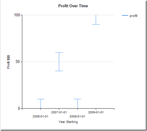
On the report itself I have a single (Error Bar) chart with the profit as it’s value axis and the year as it’s category axis. I modify the min/max and interval values to 0, 100 and 50 respectively and get a graph similar to that below.
Now it should be a simple matter of renaming the 0, 50, 100 intervals to bad, good and better, right? Wrong! This is where the trouble is. There is no pre-defined field used to perform this task and the .NET string formatters that allow you to format the text are true to their word – they allow you to format – not manipulate!
Desperation
It is strange to be so close to a goal without being able to reach it. After pushing the UI further than I knew how to push it, and attempting to manipulate the RDL code itself in hope of finding somewhere where a string replace could be used I resorted to Google – only to find that no solutions were openly available.
I like to give credit where it is due and all credit goes to the wonderful http://www.stackoverflow.com.
After posting a bounty I finally found a fix that worked for me:
http://stackoverflow.com/questions/942086/reporting-services-chart-custom-axis-label
The Solution
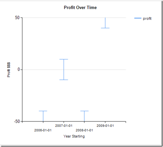
In order to use text data instead of the numeric data I had to modify my min and max interval values for the Y-axis to –50 and 50 respectively. They looked a little something like this:
Then, I had to normalize my data to reflect this change. This was simply a matter of subtracting 50 from each of my Center, Lower Error and Upper Error values.
The values became the following expressions:
Center Value: =Sum(Fields!profit.Value) - 50
Lower Error: =Sum(Fields!profit.Value) - 10 - 50
Upper Error: =Sum(Fields!profit.Value) -50 + 10
Please note: the lower and upper error values are used because this is an Error Bar chart and do not appear in most chart types. the –10 and +10 in corresponding expressions is arbitrary for illustrative purposes.
Normalizing the data left me with a similar chart to before, but the Y-axis values now range between –50 and 50 instead of 0 and 100.
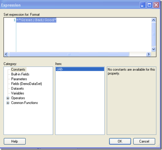
Finally, we are able to use these values to format the interval labels with an Excel format code (pos;neg;zero). In our case we use the expression ="Great;Bad;Good"
The Result
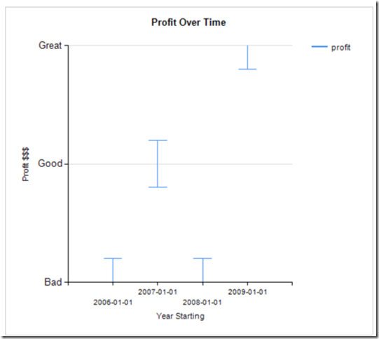
The result is quite simple considering the required work and the below screenshot shows the chart with the newly added text labels.
Luckily for me, i only needed 3 intervals. If anyone out there has an easier way to do this I would LOVE to hear about it!


Comments