Balsamiq Mockups
I'm breaking my (unplanned) blogging hiatus to write a review of a screen mockup tool, Balsamiq Mockups, that I received a copy of late in 2009. While I had hoped to write a couple of technical posts before my next round of tooling reviews (for fear of becoming a sellout) I have a couple of posts that I am eager to get out there that will deal specifically with tooling and have decided it is better to post something than nothing. Without further ado…
Over the last two years I've been moving from a development to PM role and screen mockups have become one of my core competencies, part of my job that I really enjoy and something that I have spent an enormous amount of time on. While some favor interactive demos I find screen mockups, at least early in the design phase, to be a very cost effective medium for requirement elicitation. They require little technical skill to develop, are quick to create and are cheap to throw away.
Until now my major issue has been finding the right tool for the job. I’ve used everything from Excel to Expression Blend in an attempt to create detailed mockups that present information to the project sponsors as they would expect to see it in a production environment.
State of the Union
The tools I use most often are Visio, Excel and Expression Blend (in that order). Here is the mandatory rundown:
Microsoft Visio: Up until now Visio has been my goto mockup tool. While not a mockup tool by design , it does contain the requisite controls (such as buttons, textboxes, scrollbars, etc.) for screen design as well as a plethora of shapes that facilitate my goals. I take screenshots from existing applications onto which I overlay new screens and/or navigation menus in order to provide the project sponsors with realistic projections of how new screens (or entire applications) will look and function. Visio is really awesome, but it was not meant as a screen mockup tool meaning that ingenuity is often necessary and things take a little (or lot) longer than they really should. Because I’m using it beyond its actual purpose it often feels clunky to use and it is often frustrating to sink time into something basic…like a datagrid. Creating a simple datagrid has been a headache since I started mockups with Visio – there are some stock tables in Visio which can be chained together to look like a datagrid. However limiting the number of rows, embedding more complex children etc. tends to be a nightmare and slow me down to the point of frustration. There has to be a better way…
Microsoft Excel: Don’t knock it! Like it or not, most users (especially where financial systems are concerned) want their application to look and function like Excel, so it stands to reason that the grid based approach is a popular one. I wouldn’t mockup a whole UI in Excel but wherever I need a quick-and-dirty-grid there is no faster or better solution than to use Excel. However, these mockups are useful internally (between developers) and are normally a precursor to a full-blown mockup in video.
Microsoft Expression Blend: Expression Blend is a tool that I used somewhat infrequently due to constant (out-of-)memory-related crashes. It seems to be exactly what I need but my primary development box needs upgrading and is apparently not powerful enough to safely run Blend. Without constant saving, I am at the risk of losing my work and therefore am uncomfortable using this application. The other issue, regardless of spec requirements, is that Blend seems a little overkill (and therefore can be more slow and clunky) for what I need. Code generation is great if you need it, but I do not. It is important to me that mockups are dispensable and a speedy tool is much more important to me than one that will help build my code. Don’t get me wrong – I’m neither mocking Blend nor Code Generation in general – they are both pretty cool. They are just slow me down at this stage of the design process.
Getting to grips with Balsamiq Mockups
At $90 Mockups is a fairly inexpensive (relative to other offerings in the design/development space) tool used to create wireframes. I’ve seen it blogged about numerous times and have always wanted to give it a try – so late last year I decided to do that and contacted the Balsamiq team who generously provided me with a copy for this review.
The Good
Intuitiveness: Mockups may be one of the most intuitive tools I have ever used. Things work the way you’d expect them to work which is extremely refreshing especially when it comes to populating seemingly advanced controls with data. Take for example the datagrid. Many mockups that I create contain some sort of data grid or table and to date this is probably my greatest frustration when working with Visio to create mockups. It tends to be a labor-intensive and inflexible process especially when adding sub-controls to the grid. Customizing the number of rows in a grid is somewhat of a nightmare and a process that should be simple consumes far more time, energy and hair than it really should!
Take the approach with Mockups on the other hand. All i have to do is drag a datagrid from the controls menu onto my canvas. Something like the following appears.
I double click to edit the data and I see the following:
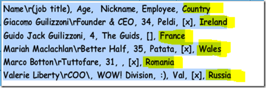
As expected, the top row shows column headers and the remaining rows are rows in the datagrid. Cells are comma-delimited so to add a column I simply add the desired item to each row as follows:
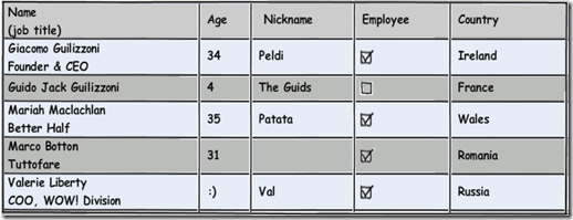
Also, looking at the above screenshot of the datagrid you’ll notice I have a bunch of unused rows. Rather than taking a menu-driven approach to add/remove rows, in Mockups I simply resize the datagrid to hide unwanted data. Presto…
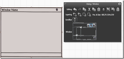
This is a simple example but it is only simple because Mockups makes everything so straightforward. This mockup was created in less than 1 minute which to me is extremely impressive. And most things in the tool work just like! Take for instance the context menus that appear upon clicking a control in your mockup. They are extremely simple and provide exactly the options that you need and only the options that you need. Take the Dialog/Window creation context menu in the screenshot below. Rather than a complex text based menu, you’ll notice a small representation of the window itself where you can choose to modify the height of the task/status bars, show or hide the close/maximize/minimize buttons etc. etc. The point I’m trying to get at hear is that with Mockups you never really have to think very hard – a lot of time appears to have been spent thinking about how people would use the tool so that you don’t have to…
Speed: This point may overlap with intuitiveness a little bit but I defy you to show me a screen that cannot be mocked up with this tool in a matter of minutes. As I hopefully demonstrated in the above datagrid example, Mockups allows relatively complex tasks to be performed with ease. There are a large number of standard controls baked right into the application allowing everything from buttons to textboxes and iPhone mockups to pie charts to be dragged onto the screen and used in mockups. While there is a limit to the number of inbuilt controls there appears to be a community growing around the application leading to the creation of the site Mockups To Go, a spot where users post their templates for download. These range from simple search boxes to Facebook clones and add greatly to the value of the application.
Performance: While other mockup tools are slow this one is extremely lightweight and seems to have little to no memory/processor overhead. The importance of this last point cannot be underestimated. I have never (not once) seen the tool drag or slow to a crawl, no matter what the activity. I cannot say as much about many other applications and it makes the overall experience extremely pleasant and makes me much more efficient.
Portability: Admittedly this is not all that important to me, but I got excited last week when I discovered that the Android platform is soon to (if it doesn’t already) support the Adobe Air platform. I’m planning to buy an Android Table/eReader this summer (Notion Ink’s Adam if you must know) and love the idea that I can use this application on both my Windows PC and my tablet. It’ll be interesting to see how it works with a touchscreen and perhaps i’ll report my findings when the Adam is released…
The below screenshot is my blog imported into Mockups and sketched – the sketching being a simple single-checkbox checking motion. I’m not sure why I’m posting this, other than the fact that it looks awesome! 
The Bad
“Intentionally rough and low-fidelity”: One of the selling points of Mockups is that the wireframes are low-fi by design and this helps stakeholders focus on structure rather than bells-and-whistles (my terminology). While I understand this, and appreciate it to a point, this is a complete deal breaker for me. As a communication mechanism between developers and/or managers this is not a problem – I don’t need anything fancy and the least work for the most gain is always appealing! However, while the back-of-a-napkin approach may be effective in this scenario it doesn’t exactly scream professionalism when attempting to sell the design to a client or project sponsor. Not to put too fine a point on it but I would personally be embarrassed to bring Furthermore, I feel that it is beneficial to said project sponsor to see the new design integrated with their existing application look-and-feel where applicable or with a higher level of sheen otherwise. This single flaw stops me using the tool in my day-to-day design and sends me packing back to the world of unholy hybrid design.
I implore the Balsamiq team to introduce a post-processing feature that turns a wireframe mockup into something that actually looks like a real screen. Convert the sketched buttons and textboxes into bitmaps of their windows/web counterparts and without a doubt you have a killer product that can be used for both wireframes and fleshed out screen designs. Easy for me to say, of course, but surely worthwhile.
Finicky contextual control: This is minor compared to my last point but is a constant niggle so I’ll mention it here. The contextual control (see the semi-opaque panel on the RHS below) appears when you click on an existing control in your mockup. The problem with this control is has multiple states – appearing semi-opaque upon clicking on a control and fully opaque upon hovering over the contextual menu itself. I constantly seem to run into scenarios where the menu disappears right before I click on the item I want, or takes a millisecond longer to become fully opaque than I would like. I guess my real annoyance is that it doesn’t need to act this way as it doesn’t seem to deliver any additional value. If this could be always visible (even docked on one side of the screen) I’d be a happy camper.
The Summary
All-in-all I can’t help but respect Balsamiq’s offering. The tool is extremely easy to use and wonderfully fast. The lifetime license is a steal at $90 and could easily save that in a handful of screen designs. Seriously, even using a contrived average wage of $20 per hour a return on investment could be achieved when designing the most simple of applications. There are bells and whistles that could be added and a few minor annoyances that could be remedied but it’s one major flaw is undoubtedly the inability to generate anything more fleshed out than a wireframe. It is a design decision, I understand, but it must be a barrier to usage for many designers/developers out there. If this changes in the future I will undoubtedly use Balsamiq Mockups as my mockup tool of choice. As is, Balsamiq can only brings me halfway…then I have to start over in Visio…If all you care about is quick wireframes then you need to buy this tool. If you want sheen like I do then join me in requesting this additional capability!


Comments
rather confusing sites lately, this cleared up a lot confusion I had.
don't give up and also keep posting simply because it simply just that is worth to look through it.
excited to read even more of your stories, cheers :)